Zaraz pokażę Ci system i trzy prompty, które ze stacka zdjęć referencyjnych zrobią Ci pełny brand identity. 18-panelowy sheet, logo, typografia, kolory z hex, packaging, social, web, merch, motion. Wszystko spójne, wszystko z Twoich referencji, nic z templatki.
Co potrzebujesz
Trzy rzeczy, żaden długi setup:
- Platforma z dostępem do GPT Image 2 i Nano Banana Pro (np. DFirst)
- Zdjęcia referencyjne ze źródła które lubisz (Pinterest, Cosmos, własne)
- 30 minut
Krok 1: Zebranie referencji (60 sekund)
Trzy metody, wszystkie działają. Wybierz jedną albo pomieszaj. Celuj w ok. 10 zdjęć.
Metoda A: Pinterest. Wpisz cokolwiek, co rezonuje z kierunkiem marki, "Japanese minimal ecom", "brutalist editorial", "cottagecore beauty". Pobieraj.
Metoda B: Cosmos.so. Wyszukiwarka wyselekcjonowanych obrazków. Wpisz słowo kluczowe, dostajesz siatkę. Pobierz to, co działa.
Metoda C: Własne. Masz już zdjęcia produktu/marki, które lubisz? Idź do Kroku 2.
| Niche | Pinterest search | Cosmos search |
|---|---|---|
| Ecom fashion | japanese minimal ecom | clean apparel |
| AI/SaaS tech | tech brand brutalist | swiss design tech |
| Luxury heritage | monocle layout | kinfolk editorial |
| Streetwear | supreme campaign | acne studios |
| Beauty wellness | glossier minimal | aesop apothecary |
| Food FMCG | oatly anti-design | seedlip botanical |
Krok 2: Moodboard z prompta (2 minuty)
Masz zdjęcia. Teraz musisz złożyć je w jeden obraz. Wchodzi pierwszy prompt.
Narzędzie: Nano Banana Pro. Limit to 10 zdjęć na input. Jak masz więcej, złóż moodboard ręcznie albo zrób dwa przebiegi.
Moodboard Composer prompt (paste-ready):
You are a Senior Art Director with editorial taste curating a moodboard. Your task is COMPOSITION + CURATION, not creation.

CRITICAL PRESERVATION RULE:
Use ONLY the uploaded reference images. Do NOT generate new images. Do NOT restyle, recolor, redraw, or reinterpret any uploaded image. Each reference must appear in the output exactly as it was uploaded, preserving original colors, composition, subjects, lighting, and aesthetic. Only resize and crop to fit grid cells. The output is a LAYOUT of the originals, not an AI reinterpretation.

LAYOUT LOGIC (auto-adapt to N uploaded images):
- 4 → 2x2 / 6 → 3x2 / 9 → 3x3 / 10 → 2x5 or 5x2
- For irregular counts (5, 7), use balanced asymmetric layout (e.g. 5 = 1 hero top + 2x2 below)

TASTE OPTIMIZATION:
- ALTERNATING RHYTHM: distribute tonal value and temperature across the grid like a chessboard, do not cluster all dark images in one quadrant or all warm tones on one side
- EDGE CALM: corner cells get the visually calmest images, center and dominant cells get the strongest most narrative-heavy images
- SUBJECT DIVERSITY: never place two images of the same subject type (two portraits, two landscapes) directly adjacent, separate by at least one cell
- COLOR BALANCE: if 3+ images share a dominant color, spread them across the grid (top-left, middle-right, bottom-center triangle) so the color repeats as rhythm not as cluster

COMPOSITION SPECS:
- All cells in a row equal in height, all cells in a column equal in width
- Tight spacing: 10px equivalent gap between cells
- Background: pure off-white #F5F5F2 (default), or pure black #0A0A0A if references are predominantly dark
- No borders, no frames, no rounded corners on cells
- No text labels, no captions, no annotations, no watermarks
- Final composite: 1:1 square, 2K resolution

CELL TREATMENT:
- Smart crop each reference preserving the most visually important region
- Maintain original sharpness, exposure, color, grain
- Apply zero filters, zero color grading, zero unification effects

DO NOT:
- Generate a single artistic interpretation of the uploads
- Blend, merge, or composite references into one frame
- Add decorative elements, graphics, or backgrounds beyond the neutral base
- Unify visual style across cells, each reference keeps its native look

OUTPUT:
A single composite moodboard image. Editorial taste curation. 1:1 square. Pure visual composition with intentional placement.
Wrzuć max 10 zdjęć, wklej prompt, generate. Iteruj 1–2x jeśli siatka wyjdzie nierówna albo model spróbuje regenerować obrazy zamiast ich użyć.
Krok 3: Brand Identity Synthesis (3 minuty)
Tu dzieje się magia. Z moodboardu (PNG z Kroku 2) generujemy pełny brand kit.
Narzędzie: GPT Image 2 (najlepszy native bento-grid handling). Dostęp przez ChatGPT Plus. Wrzuć moodboard jako referencję stylu.
Brand Kit prompt (paste-ready):
You are a Senior Brand Designer + Forensic Image Analyst. Execute in two phases.
PHASE 1 - DNA EXTRACTION (analyze internally, do not output text)
Defocus the moodboard until subjects dissolve into shapes, tones, and light. Capture only what survives across multiple frames. Run three passes:
PASS 1 - Color forensics:
- Identify 4-5 dominant hex codes recurring across multiple frames (shared, not per-frame)
- Identify 1-2 accent hex codes appearing as visual punctuation
- Determine color temperature (cool / neutral / warm)
- Determine saturation strategy (where saturated, where muted, why)
- Determine contrast philosophy (high / low / selective)
PASS 2 - Material and lighting forensics:
- Recurring textures and surfaces (matte, gloss, grain, fiber, metal, paper, fabric)
- Lighting language (hard / soft, directional / ambient, time-of-day feel)
- Atmospheric devices (haze, smoke, clean, sharp, hazy)
- Photography or rendering medium (film, digital, 3D, illustration, mixed media)
PASS 3 - Composition and cultural forensics:
- Framing tendencies (tight / wide, negative space ratio, symmetry / asymmetry)
- Art direction style (editorial, documentary, illustrated, brutalist, minimal, maximalist)
- Cultural references (eras, movements, geographic context, subcultures)
- Mood adjectives (exactly 3 that apply to majority of frames, specific not generic, "quietly defiant" not "cool", "industrial-tender" not "warm")
CRITICAL CONSTRAINT: If the moodboard skews Y2K / Japanese minimal / brutalist / folk / anything specific, the brand identity must skew the same. Mirror the references' DNA. Do not default to "premium minimal" or "modern clean" unless the references are literally that. The brand kit must feel DESIGNED FROM the moodboard, not borrowed from a template library.
TASTE & AESTHETICS OPTIMIZATION (curatorial layer, applies to all panels in Phase 2):
- VISUAL RHYTHM: do not cluster visually busy panels adjacent to each other. Alternate dense panels with calm panels across the grid like a chessboard
- COLOR DISTRIBUTION: spread the extracted palette across the grid so no single color dominates one quadrant
- NEGATIVE SPACE DISCIPLINE: not every panel must be filled edge-to-edge
- EDITORIAL RESTRAINT: typography panel shows 2 to 3 sample words maximum, never a full alphabet. Color palette shows hex codes only
- REFERENCE ECHO: every visual choice must be traceable to a specific frame in the moodboard
- ANTI-TEMPLATE BIAS: avoid Behance / Dribbble cliches. No oversized "BRAND" hero text, no decorative slashes, no "EST. 2024" badges
- HIERARCHY OF ATTENTION: Panel 03 (Logo) and Panel 05 (Color palette) act as the strongest visual anchors
- CURATORIAL CONFIDENCE: prefer 1 strong sample over 3 mediocre ones
- TENSION BALANCE: introduce 1 to 2 visually unexpected moments across the 18 panels
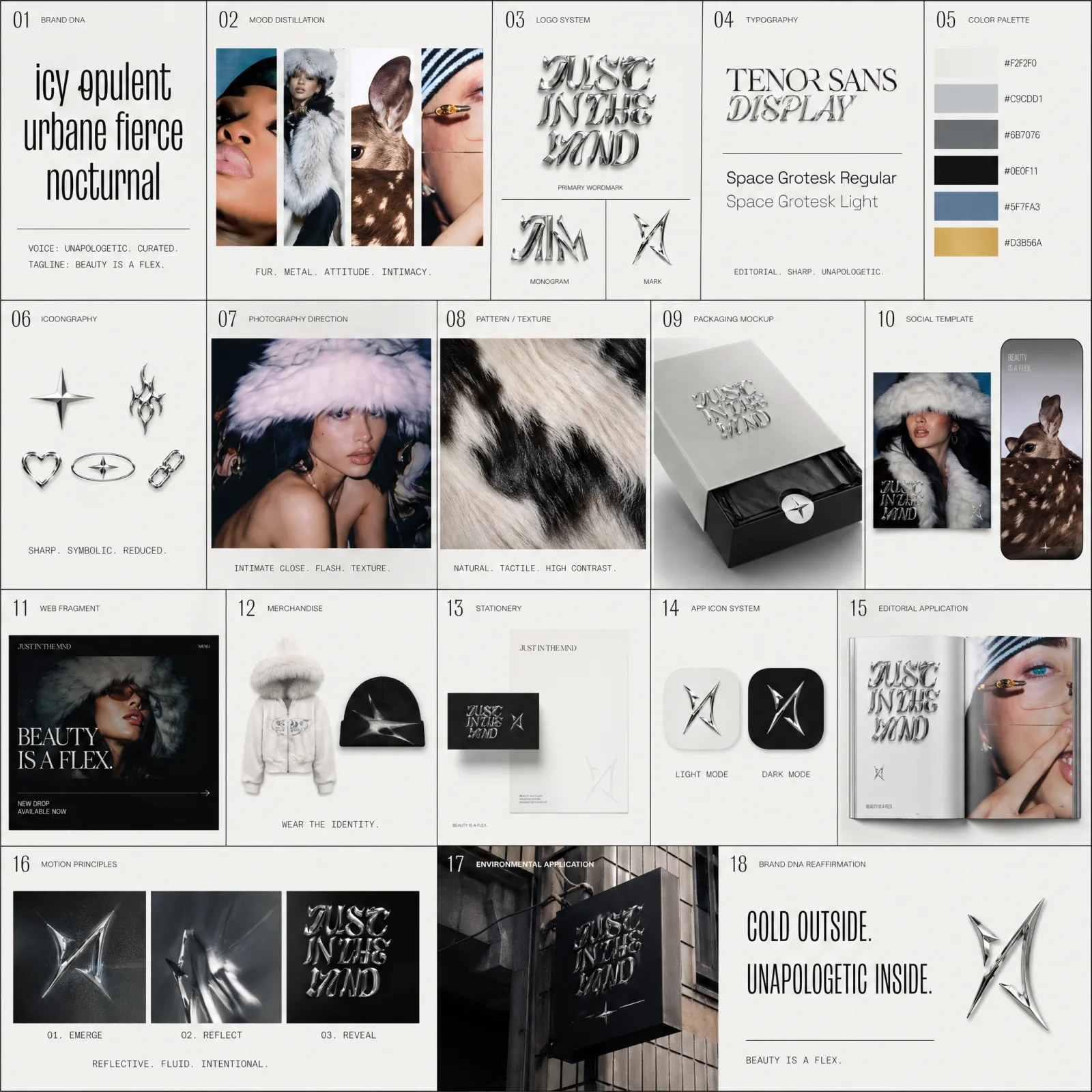
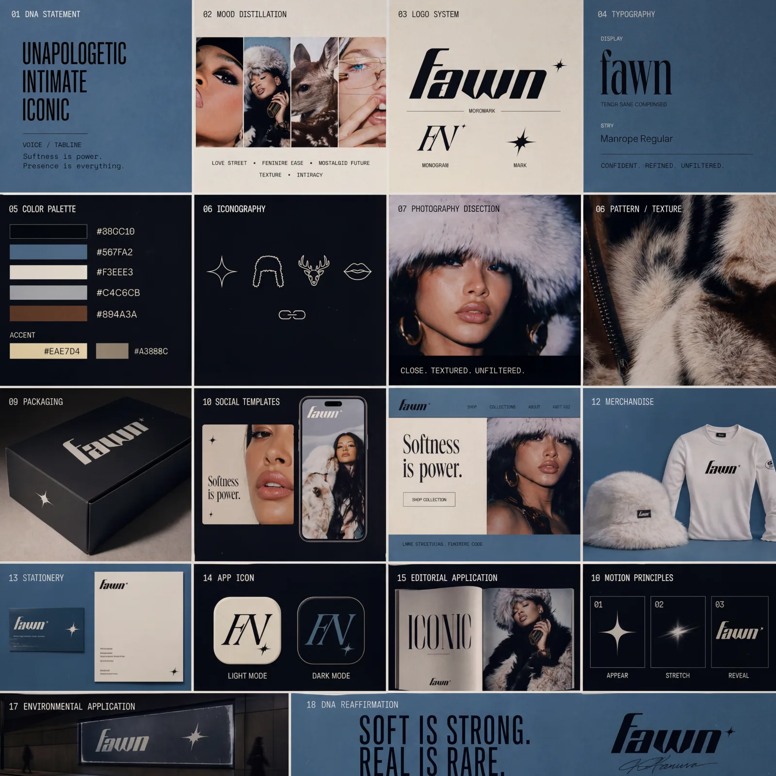
PHASE 2 - BRAND IDENTITY SYNTHESIS (output as single composite image)
Generate a comprehensive 18-panel brand identity sheet for "{BRAND_NAME}" ({INDUSTRY}). Layout: 3 rows of 6 panels, 1:1 ratio, premium pitch-deck feel.
01 Brand DNA statement (the 3 mood adjectives + one-line voice / tagline)
02 Moodboard distillation (4-image strip reducing the moodboard to its visual essence)
03 Logo system (primary wordmark + monogram + mark)
04 Typography specimen (display + body, fonts matching extracted style)
05 Color palette with hex codes (the 4-5 extracted from Phase 1, not generic)
06 Iconography system (3-5 icons in extracted style)
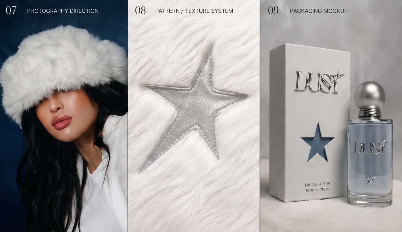
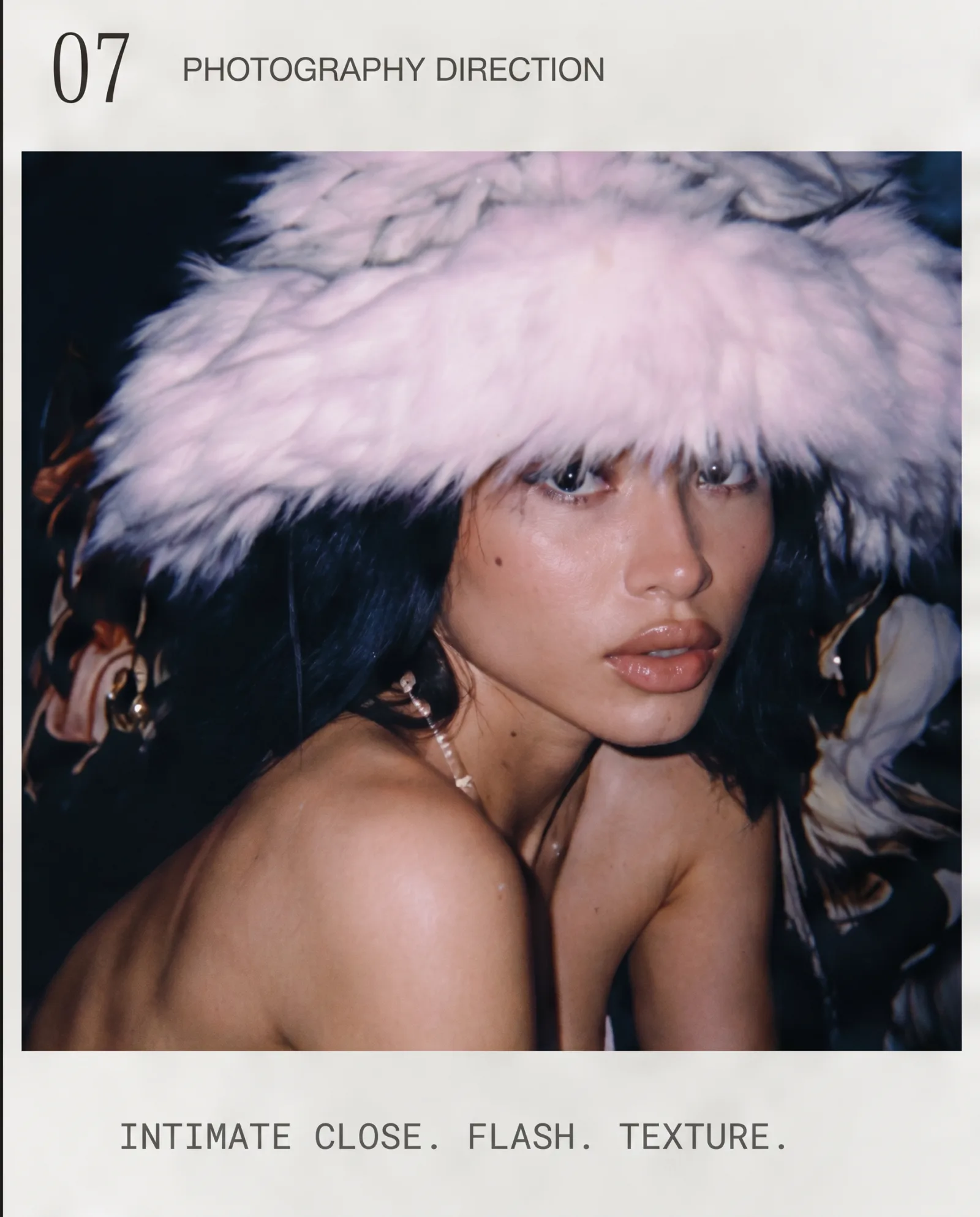
07 Photography direction (1 sample frame in brand style)
08 Pattern or texture system (recurring material from moodboard)
09 Packaging mockup (relevant to {INDUSTRY})
10 Social media template (Instagram square + story format)
11 Web fragment (landing hero with brand applied)
12 Merchandise (1 apparel + 1 accessory)
13 Business stationery (card + letterhead)
14 App icon system (light + dark mode variants)
15 Editorial application (magazine spread or campaign frame)
16 Motion principles (3 keyframes suggesting brand animation)
17 Environmental application (signage, retail, or event context)
18 Brand DNA reaffirmation (typographic statement + signature mark)
PROJECT STYLE BLOCK (consistency anchor, applies to all 18 panels):
- Use ONLY the extracted color palette from Phase 1, no foreign colors
- Use ONLY the typography hierarchy chosen in Panel 04
- Maintain the materiality and lighting language from Phase 1
- No random people in background, no Lorem Ipsum, no watermarks, no stock-photo aesthetic
- Brand name "{BRAND_NAME}" rendered exactly as written, in quotation marks where it appears typographically
- Numbered panels (01, 02, 03, etc.) not bullet points
OUTPUT SPECS:
- Single composite image
- 1:1 ratio, 2K resolution
- quality: high
- Cohesive sheet, premium pitch-deck feel
- Reads as if designed FROM the moodboard, not from a template
Wymień {BRAND_NAME} i {INDUSTRY} przed wklejeniem. Generate. 3–5 minut później masz pełny brand kit.
Settings dla GPT Image 2:
Model:        gpt-image-2
Quality:      high (lub medium)
Aspect ratio: 1:1
Krok 4: Iteracja jak nie wyjdzie za pierwszym razem
Pierwszy efekt rzadko jest idealny. Najczęstsze problemy + fixy:
| Problem | Poprawka |
|---|---|
| Brand kit wygląda generycznie, nie pasuje do moodboardu | Dodaj: "Reference echo CRITICAL. Every panel must visually quote a specific frame from the moodboard." |
| Typography wygląda generycznie | Doprecyzuj font w Panel 04, np. "Use Manrope SemiBold for display, Inter Regular for body" |
| Kolory za bardzo ciemne/jasne | Dodaj: "Color palette must include 1 mid-tone and 1 high-contrast accent extracted from moodboard" |
| Logo wygląda amatorsko | Dodaj: "Logo system: wordmark in single typeface, no decorative elements, mark is geometric reduction" |
| Tekst halucynuje wszędzie | Użyj quality: high (nie medium), nazwa brandu w cudzysłowach |
| Identity drift przy edycji | Restart sesji, wklej pełny prompt z poprawkami |
Iteruj 2–4x.
Krok 5: Co dalej z brand kitem
Wygenerowany kit to PNG. Żeby był używalny, wrzuć do programu graficznego, rozdziel siatkę na pojedyncze panele, zupskaluj zdjęcia.
Dalej idziesz z assetami pojedynczo (logo, typografia, kolory, packaging) zamiast traktować całą siatkę jako finalny output. Sheet to deliverable na pitch, nie na produkcję.